

New UNCW logo spurs strong reactions from student body
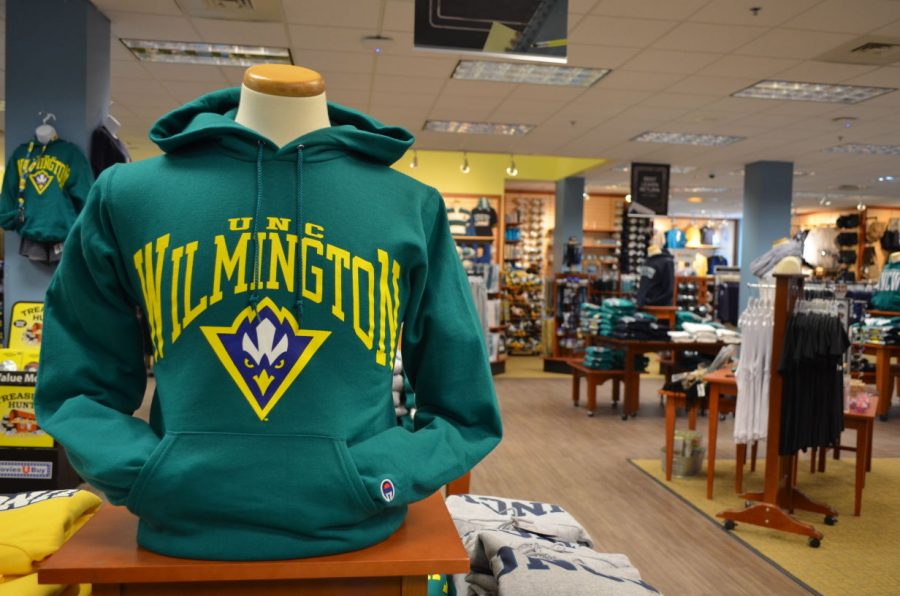
The new logo for UNCW found in the campus bookstore.
On Jan. 28, UNCW’s highly anticipated new athletics logo was revealed to the student body. With 13 years since the last one debuted, this change has been long awaited, and the hype surrounding its release created a polarized reaction from the student body.
Those who love the new logo are primarily sports enthusiasts who favor the more intense look of the Seahawk, swooping in with his eyes dead set on his prey. Sammy’s new look is much fiercer, and therefore more intimidating to rival universities. It allows us to be viewed as a serious competitor, crucial for an athletic department that is still fairly new in the grand scheme of universities.
Contrary to UNCW’s hopes, however, the halls have also been buzzing with criticisms, including that the logo is unoriginal, even boring, and certainly not worth the whopping cost of $26,000.
Yet the logo brings a new level of strength and freshness that matches this year’s new chancellor and basketball coach. Our school’s sporting life is dramatically changing, and it’s appropriate our athletics logo does the same. Regardless of the aesthetic appeal of the design, the new logo has stirred hype among the student body that has rejuvenated our excitement for UNCW athletics.
The reveal of the new logo (and the promise of a free t-shirt) brought me to the stands, and by the look of the jam-packed student section, the unveiling had the same effect on many others.
One of my more sports-inclined friends, Zach Jaimes, has been hearing some of the criticisms, but still considers the logo a big improvement. He finds it more modern, sleek, and similar to the quality of other major universities. He already owns three t-shirts dawning the new logo and has been waiting for more to become available at the campus bookstore. The bookstore’s difficulty in meeting demand makes it clear there are some students, like Zach, who can’t get enough of the design.
Additionally from a business standpoint, it is easy to understand the reasoning behind the fresh logo. As Zach pointed out, the cost of the design was nothing compared to how much the university will make this year, especially from new apparel featuring the new Sammy. Students who were already stocked on dub merchandise now have a reason to hit up the campus store again, this time for something that represents a turnaround year for UNCW athletics.
Despite my overall positive impression of our new athletics logo, I do agree with my friend Ashley DeLeon in that the creation process should have been handled differently. Instead of recruiting an outside source to form a design, I believe that UNCW should have opened a competition up to students. Giving us the power to vote on the best design or even create one of our own, would have fueled excitement for the project and would have cut the cost.
My hope is when it comes times for Sammy to get his next update, the student body will have more of a say. Until then, I think the ferocity and freshness of our new logo better suits our athletic department and that is something to appreciate.