


UNC system rebrands itself, releasing new logo and promotional video
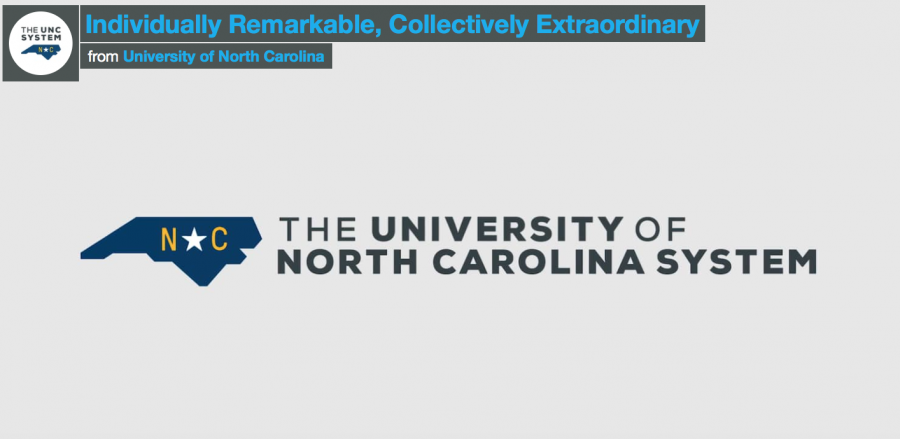
New UNC system logo displayed in The Seahawk’s informative video.
February 1, 2018
The UNC System rebranded itself this past week, unveiling a new logo and promotional video on Wednesday, Jan. 24, on their personal website.
This university system encapsulates 17 universities across North Carolina and hoped to unify this array of schools through their rebranding efforts. The 17 universities in the UNC System are: Appalachian State University; East Carolina University; Elizabeth City State University; Fayetteville State University; North Carolina A&T State University; North Carolina Central University; North Carolina State University; UNC Asheville; UNC-Chapel Hill; UNC Charlotte; UNC Greensboro; UNC Pembroke; UNC Wilmington; UNC School of the Arts; Western Carolina University; Winston-Salem State University; and the NC School of Science and Mathematics.
The $250,000 new logo and rebrand have been in the works since last April. In an effort to move away from an older logo that UNC President Margaret Spellings said looked like a Days Inn monicker, the new rebrand also seeks to show the unique but collective nature of the universities with the tagline “individually remarkable and collectively extraordinary.”
The new logo is a boxy, navy-blue outlining of the state of North Carolina with golden letters for “N” and “C”. The letters in “NC” in the logo is separated by a white star.
The old UNC System logo included a rising sun and the color maroon, prompting UNC President Margaret Spellings to compare it to the Days Inn trademark.
“Today, the University of North Carolina System is known nationally and internationally as a world-class teaching and research enterprise,” the description for the promotional video read. “Our 17 institutions, individually remarkable and collectively extraordinary, are empowering students, driving innovation, and enriching the communities around them.”
Some students within the UNC System like the new logo, but not the entire branding effort. Summer Travis, a senior at the UNC-Chapel Hill, said, “I do like the new logo better than the old one, but I’m not sure how or why the rebranding influences the branding of each of the universities individually. For example, Chapel Hill was already under a unified brand, but I got an email the other day talking about how the business school’s logo had changed to match the new branding scheme. I liked the old UNC brand better than this new one.”
Travis liked how the UNC System made the new logo from the video by connecting the different universities across the state, but she wished it had only impacted the UNC system branding and not each school’s branding. “The meaning of the new logo as presented in the video is cool,” Travis said.
However, not all students were fans of the new logo. Sarah Bigelow, a senior and nursing student at UNC-Chapel Hill, said that the new logo was unappealing and looked rather old. “The shape is not even the shape of North Carolina and is all boxy. They couldn’t make it look prettier?”
“I don’t get the point of rebranding,” Bigelow said. “Does anyone really care what it looks like? I feel like time could’ve been spent on something else. I guess I just don’t appreciate the art of rebranding and why they needed to change it. Does having a brand that says ‘we’ really make that big of a difference? Did people stare at the old one and demand, ‘Why doesn’t this scream we?’ In my eyes, life goes on with or without the brand change.”
NC State Civil Engineering major Sean Nicol disagrees with this notion, however. “I think that the old brand is not one that everyone recognizes.”